On a scale of 1 to 10 how likely would you recommend this post to a friend? — If you’ve seen this question before, you’ve run into an NPS survey. 👀
Net Promoter Score, known as NPS, is a customer-relationship metric focused on loyalty. It measures the difference between the people who would recommend your product or service against the number of people who would actively promote against it.
NPS was first introduced by Frederick F. Reichheld, the author of The Loyalty Effect, that first introduced the concept of NPS in the Harvard Business Review in 2003. In this article, he conducted a study that tried ask several questions and track the correlation of those answers to company growth over time.
But how does it work? Simply explained, the question is distributed throughout the users of your product or service, and:
- anyone who scores between 9 and 10 is considered a promoter.
- those who score between 7 or 8 are considered passives, unlikely to promote or criticize your product.
- people that score 6 and below, will be considered detractors, likely to criticize your brand and service.
We then use one must use a specific formula to calculate your product/service score:
$$NPS = \left(\frac{Promoters \times 100}{TotalRespondents}\right) - \left(\frac{Detractors \times 100}{TotalRespondents}\right)$$
If you look closely to the calculation, you’ll notice that our Passive respondents are included in the number of TotalRespondents, but do not contribute to the score itself. This is because Passives will not impact the attitude or perception over people towards brand or service.
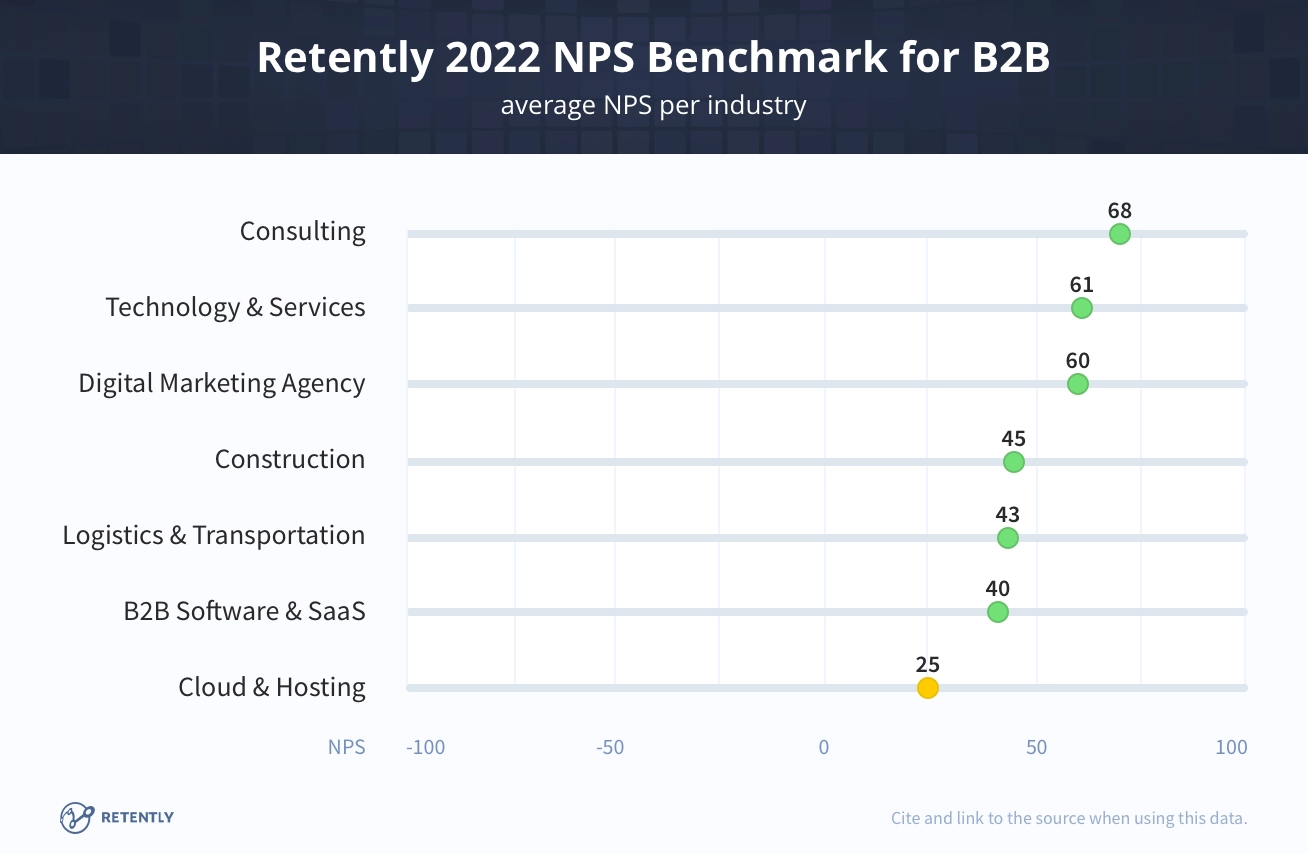
NPS can range from -100% to +100%, and what can be considered a “good” NPS score depends on your industry. Below you can find the latest results on Retently 2022 NPS benchmarks.
NPS can be useful for a number of reasons:
- It’s well-known to upper management for its correlation to growth and the fact that it is a quantifiable metrics
- It’s easy to collect, since it is purely a single question survey, which makes users more likely to respond
- It’s correlated with other metrics like perception of user experience and SUS ratings
However, it is not a perfect metric:
- When used by itself, NPS is an unreliable metric: usability is never entirely captured by subjective scores. Users will do one thing and answer another. This is why it’s so important to pair this metric not only with follow up questions, but with other types of less subjective metrics, like Task Success, Time on task, etc.
- Although it’s simple to collect, many responses are required, maybe thousands or hundreds of responses depending on your sample (I’ll later explore how to calculate the statistical significance of an NPS report)
- It can easily oversimplify data by quickly “binning” responses. For example, a design effort could change the average total score from 1 to 5, which would be a great usability increase, but still seen as a detractor. The example below illustrates this perfectly:
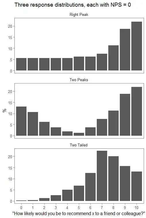
NPS is a tool to assess overall customer satisfaction for an entire brand, product or service. It may be hard to measure the impact of lower-level changes on an NPS (ex. impact of new features), but that’s why it’s so important to measure user satisfaction and task performance on a smaller scale (which can be done both qualitatively and quantitatively).
NPS is a great way to add quantifiable value to something as subjective as Loyalty. It’s simple to apply and understand, but must be used in correlation with qualitative data.
This will allow you to understand not just what is happening, but rather why it is happening.
References
- Video: Net promoter score in User experience (NNGroup)
- Net Promoter Score: What a customer-relations metrics can tell you about your user experience (NNGroup)
- What is a Good Net Promoter Score? (2022 NPS Benchmark)
- At least two reasons why you probably shouldn’t use the Net Promoter Score (Colin Fraser - Data scientist @ Facebook)